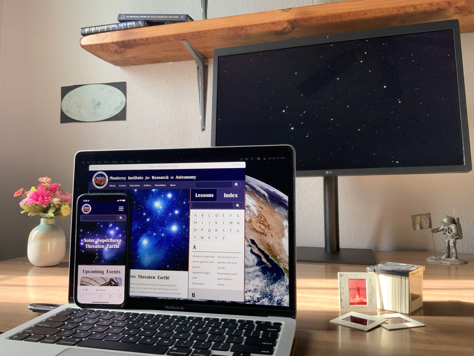
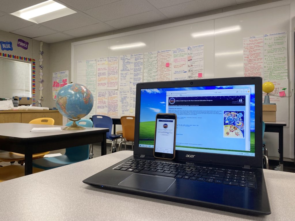
The people at MIRA, The Monterey Institute for Research in Astronomy, conduct research and educate the public with the assistance of their website. I came across the site and observed its age, wondering how I might help them realize its potential as a scientific and educational resource.
I interviewed people there who ran and visited the site to understand for who and how it is used; I did not want to come in throwing around buckets of paint and calling it a day, I needed to make things actually better for the people who need to use it.
After the interviewing and doing more research on their peers and users, I diagnosed MIRA’s specific issues and began experimenting with solutions that better serve the needs of their staff and visitors. Below you can follow the process I took to discover a design that delights both and will allow MIRA to meet their needs for a long time to come.
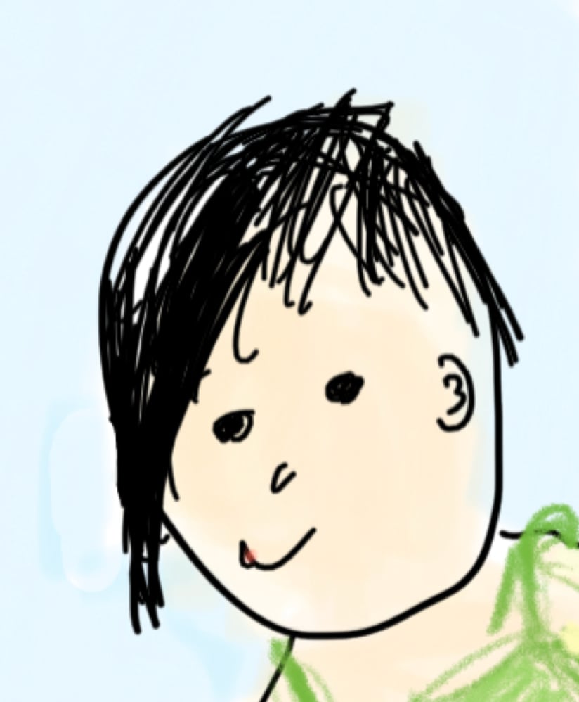
Maricia (She/her)
Student; 9 3/4 years old
Maricia is a third grader with boundless curiosity and a need to explore. With the help of her grandfather, Willis, she found MIRA and the sizable treasure trove of information it contains about the cosmos we all share.
Goals:
- Be entertained
- To know
- Be respected
Problems
- Visitors lost, stuck, unaware
- Visitor goals not being met
- Staff resources not being noticed
Solution Needs
- Curiosity-friendly navigation
- Showcase staff materials
- Expose timely information
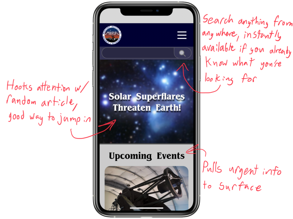
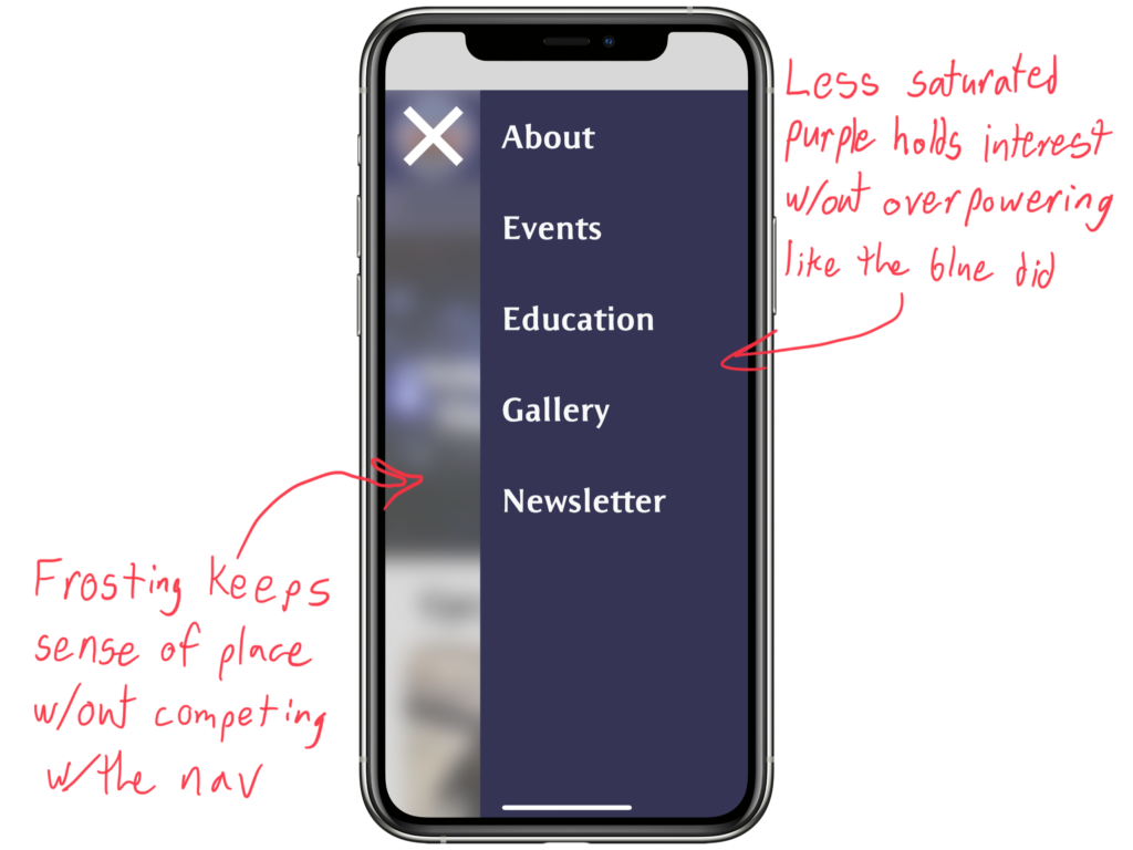
Play around with the prototype below, putting yourself in Maricia’s place. To fulfill her needs of knowledge and entertainment, find an entry that tells her something about the universe.